The following is a transcript of the above recorded talk, presented virtually for Before and Beyond Typography 2020, organized by Stanford University’s Department of History. The event was moved online due to COVID-19.
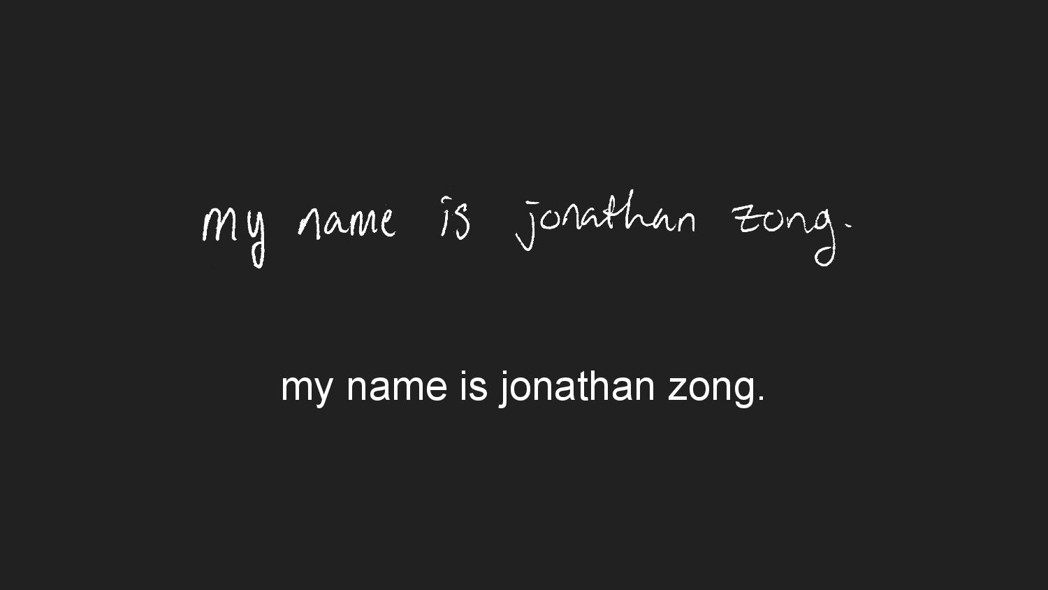
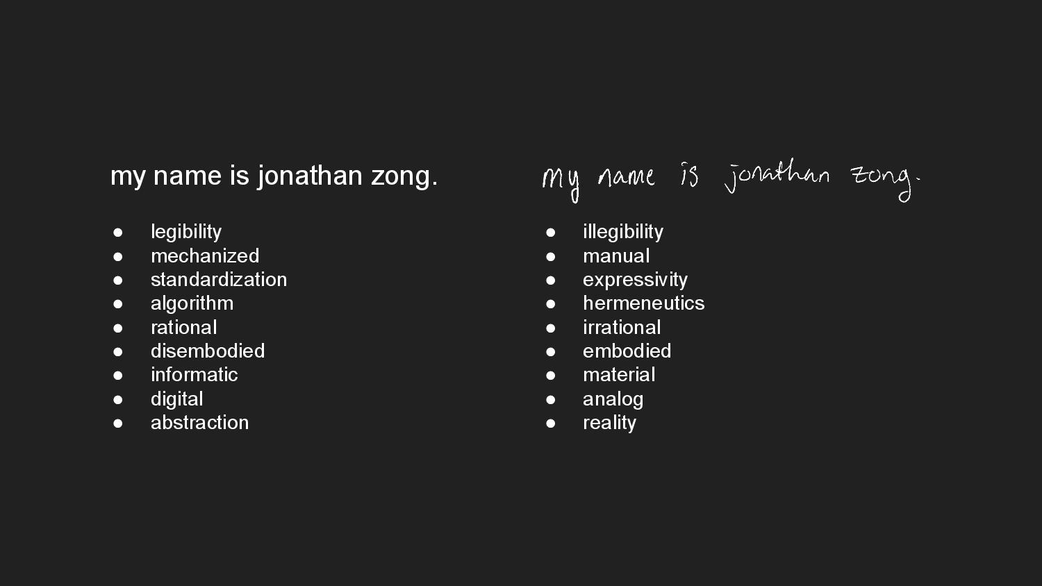
My name is Jonathan Zong. I’m a researcher and visual artist working at MIT, where I’m doing PhD work in Human-Computer Interaction. In my art practice, I use graphic design and typography as material with which to ask broader questions about technologies of social mediation and power.

In this talk I’m going to draw on the relationship between two of my typographic works, Biometric Sans and Public Display, and how these artworks help me understand the contested nature of representation within systems of data-driven surveillance.
Writing, and by extension typography, is a form of identity representation. Handwriting, for instance, is considered highly individualized and expressive. People can be identified through their handwriting, can convey aspects of tone and personality through a playful flourish or a sharp hasty scrawl. Handwriting analysis has been used as legal testimony in court, and to diagnose neurological disorders. In contrast, digital writing makes everyone’s writing look the same. People’s communications are filtered through the standardized letterforms of a font.
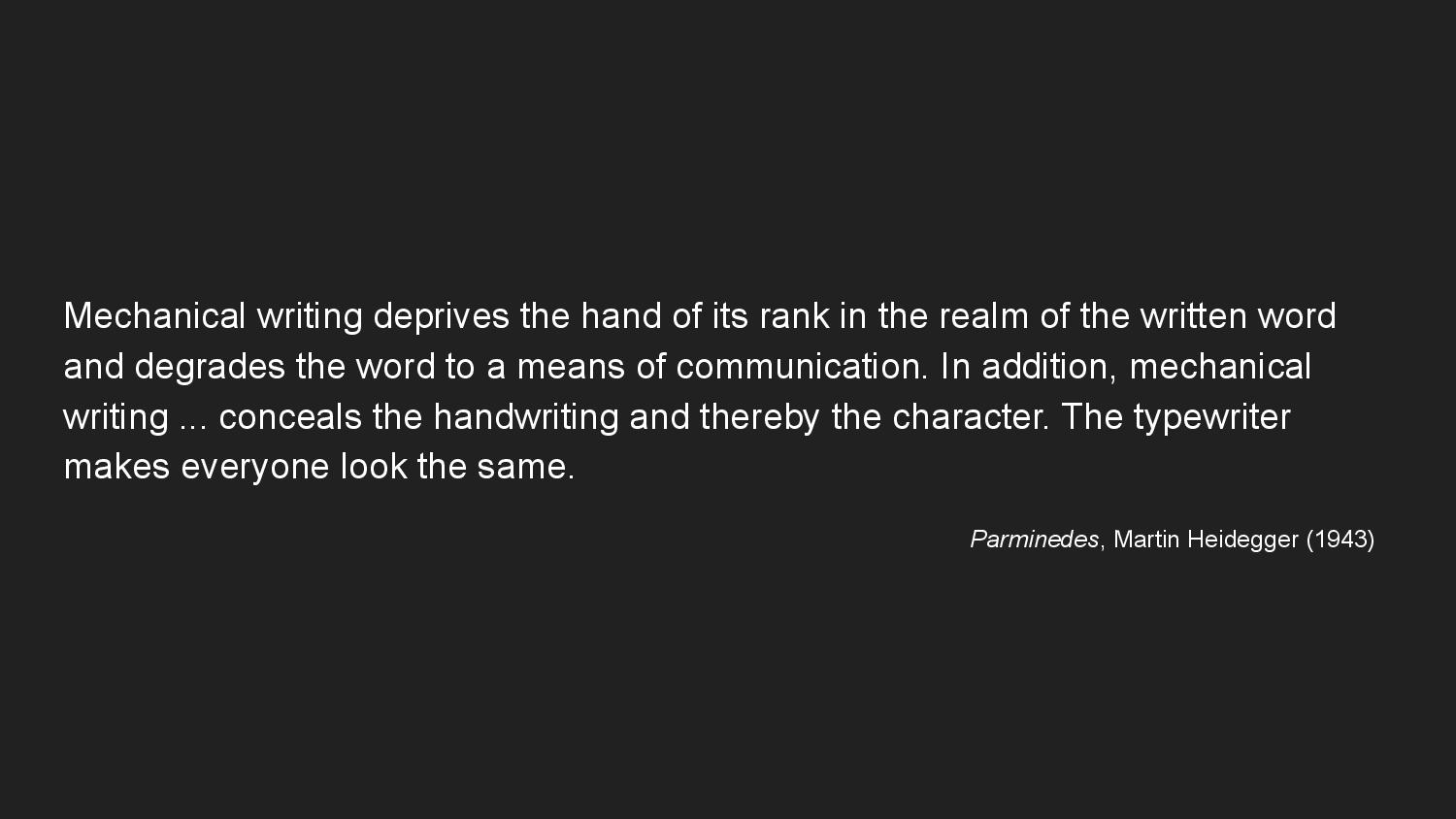
In 1943, Heidegger complained about typewriters for this reason. For him, mechanical writing using a typewriter “deprives the hand of its rank in the realm of the written word and degrades the word to a means of communication.” So there’s something about the trace of the author’s hand that, when expressed as visual form in writing, transmits not only the content of the words, but also the author’s presence.
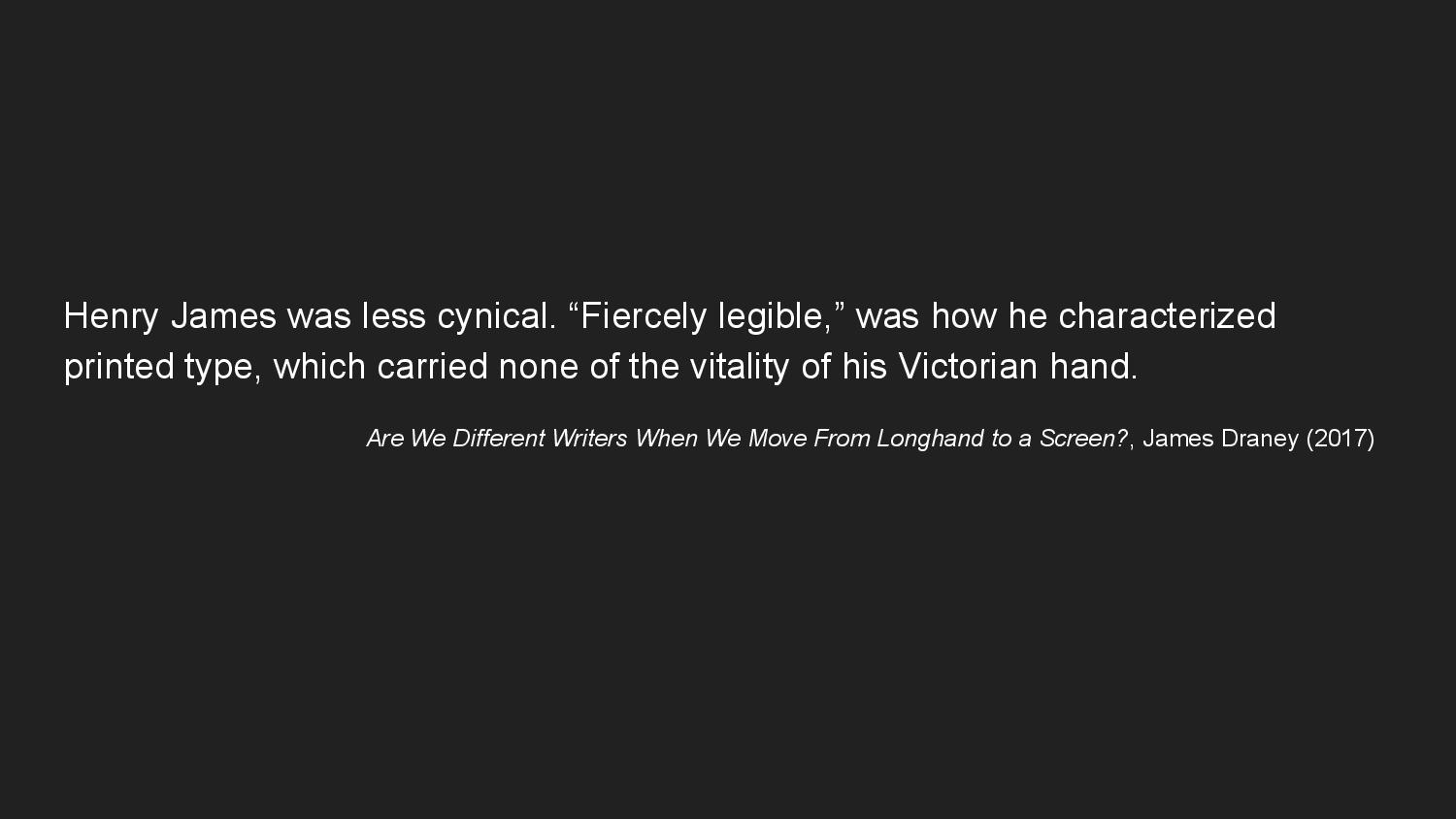
The novelist Henry James was less cynical. Experiencing rheumatism in his right wrist, he produced his manuscripts after 1897 with the aid of a Remington typewriter. Although the author’s identity in mechanical writing is obscured, or illegible, the writing itself is “fiercely legible.”
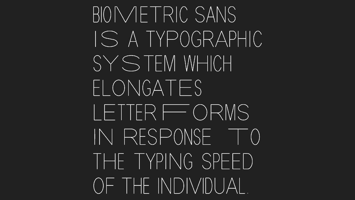
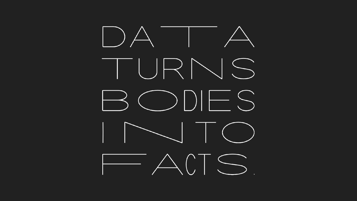
In 2018, I created Biometric Sans, a typographic system which elongates letterforms in response to the typing speed of the individual. Here I’ve used the system to typeset its description. When I type quickly and confidently, the letters are squashed thin. And when I hesitate, or have difficulty configuring my fingers to reach a certain letter, then my writing stretches longer. Biometric Sans is a gesture toward the re-embodiment of typography, the re-introduction of the hand in digital writing.
Typing, like handwriting, is an instance of what Marcel Mauss calls “techniques of the body”—how movement and gesture express an individual’s culturally inflected subjectivity. Each act of writing with Biometric Sans is an embodied performance. It’s very unlikely that the same words will ever be written twice in exactly the same way with the system. The visual appearance of the text indexes a specific moment in time. As its name suggests, Biometric Sans is inspired by the practice of keystroke biometrics, the idea that individuals are uniquely identifiable by the way that they type. If you collect enough data, so the thinking goes, you can build a biometric profile that can identify and differentiate someone by their hand.
Data, however, is a very limited way of understanding the world. There are a few problems at hand: first, that people’s multifaceted identities are more than an accumulation of facts about them. People grow and change moment to moment, while data is captured once and stored forever. Any movement from messy, embodied reality into rational, numeric abstraction will fundamentally result in flattening and loss. And second, that people’s identities resist measurement and classification. Markers of bodily difference, such as race, gender, and ability, are unstable categories. Data collection imposes measurement schemes on them to render them legible to a system, resulting in an understanding that is limited by these measures.

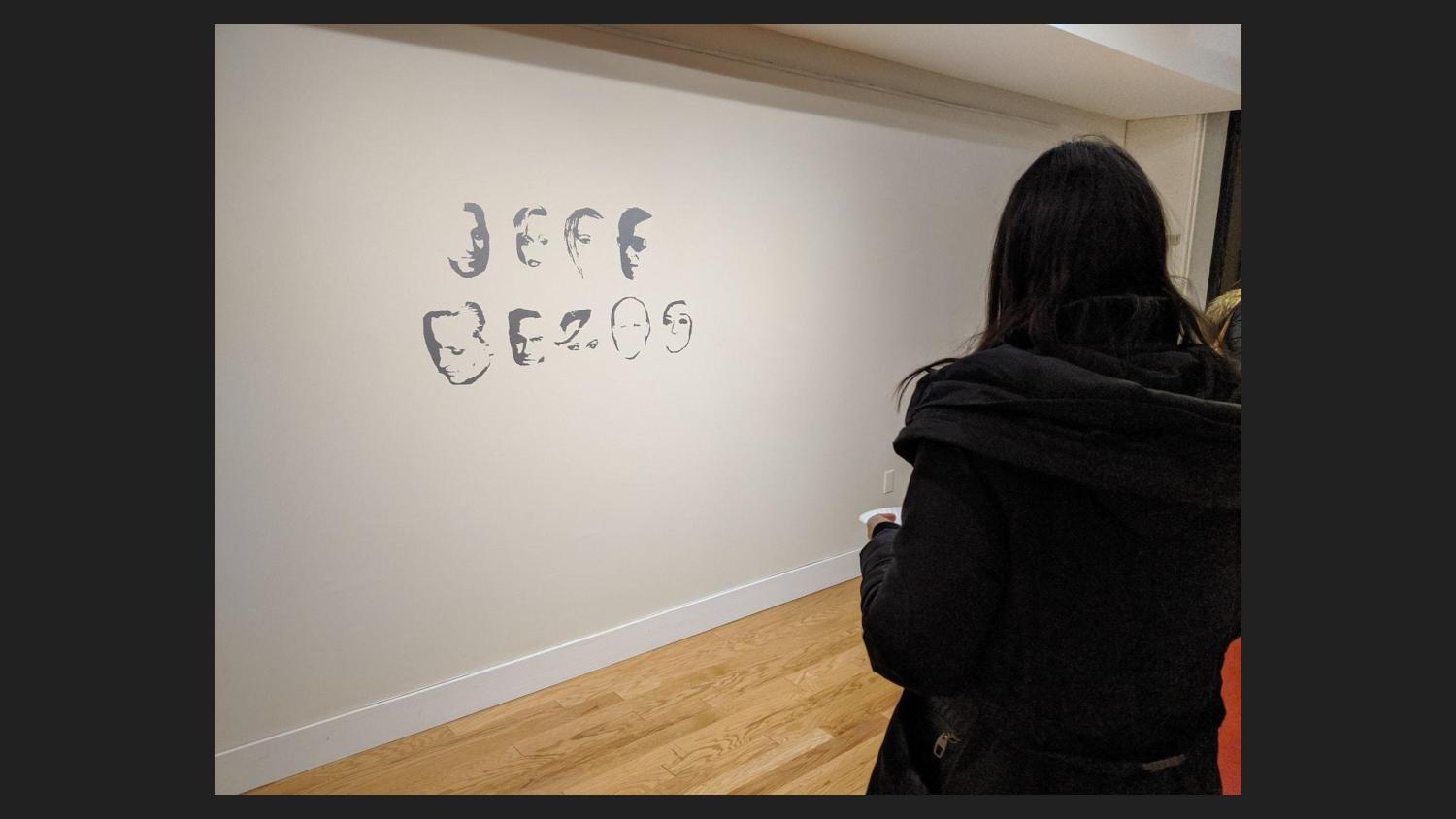
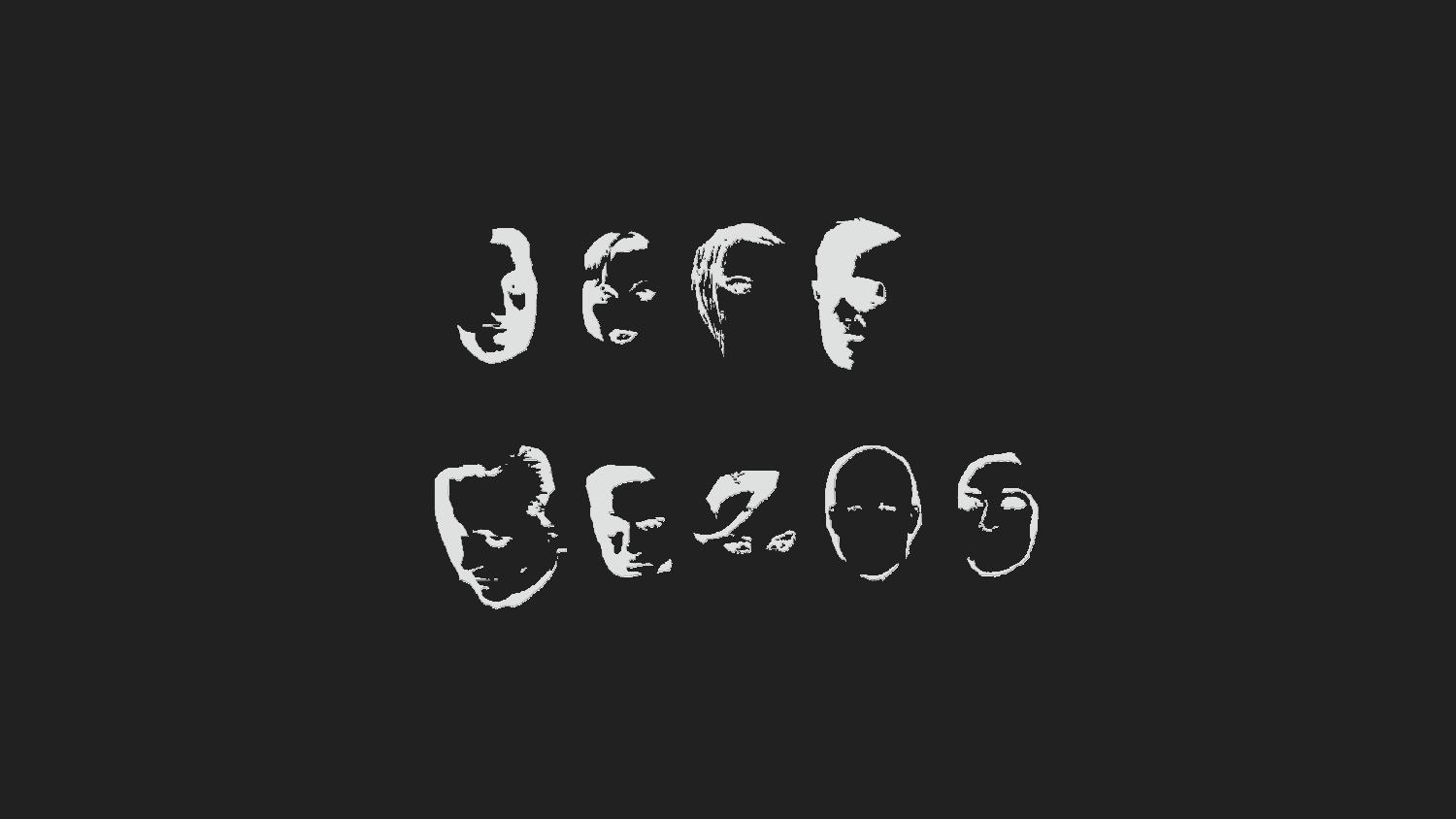
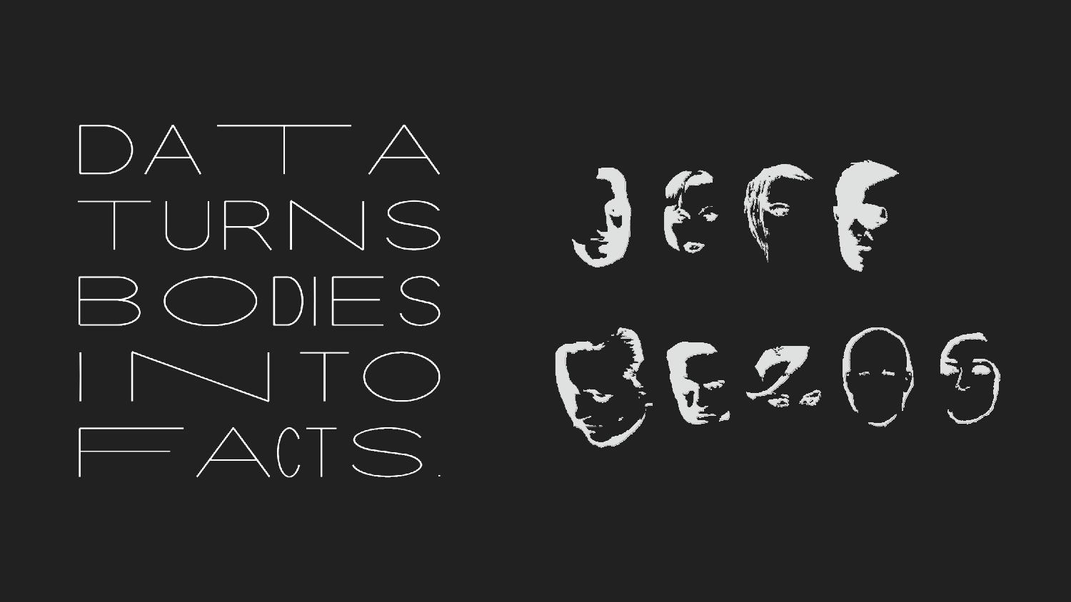
So then what does it mean that individuality and embodiment in Biometric Sans is purely understood through data collection, surveillance, and measurement? This tension became more important to me over time as I started to grapple with questions of consent and power in data collection in my PhD research, and they felt unresolved in Biometric Sans. In 2019, I created Public Display, a handmade digital display font created by erasing parts of celebrity faces from a facial recognition training dataset. This is an installation view of JEFF BEZOS, a piece I made using Public Display.

Some neuroscience researchers believe that face perception and word form recognition could be competing functions within certain parts of the brain, making it hard to read a face as a letter (and vice versa). With Public Display, I’m interested in this forced choice between the whole and the part.

To read the words, one must step back and erase the individual faces. I’ve applied a blur filter to the faces on this slide to emulate the embodied experience of stepping back in the gallery or blurring your eyes, which is difficult to communicate on a screen. The act of reading in this font requires denying the individuality of each subject in order to understand their formal characteristics in aggregate—as if from the perspective of a machine.

Focus too much on recognizing faces, and the words become illegible. This font places the acts of reading texts and reading faces into tension.
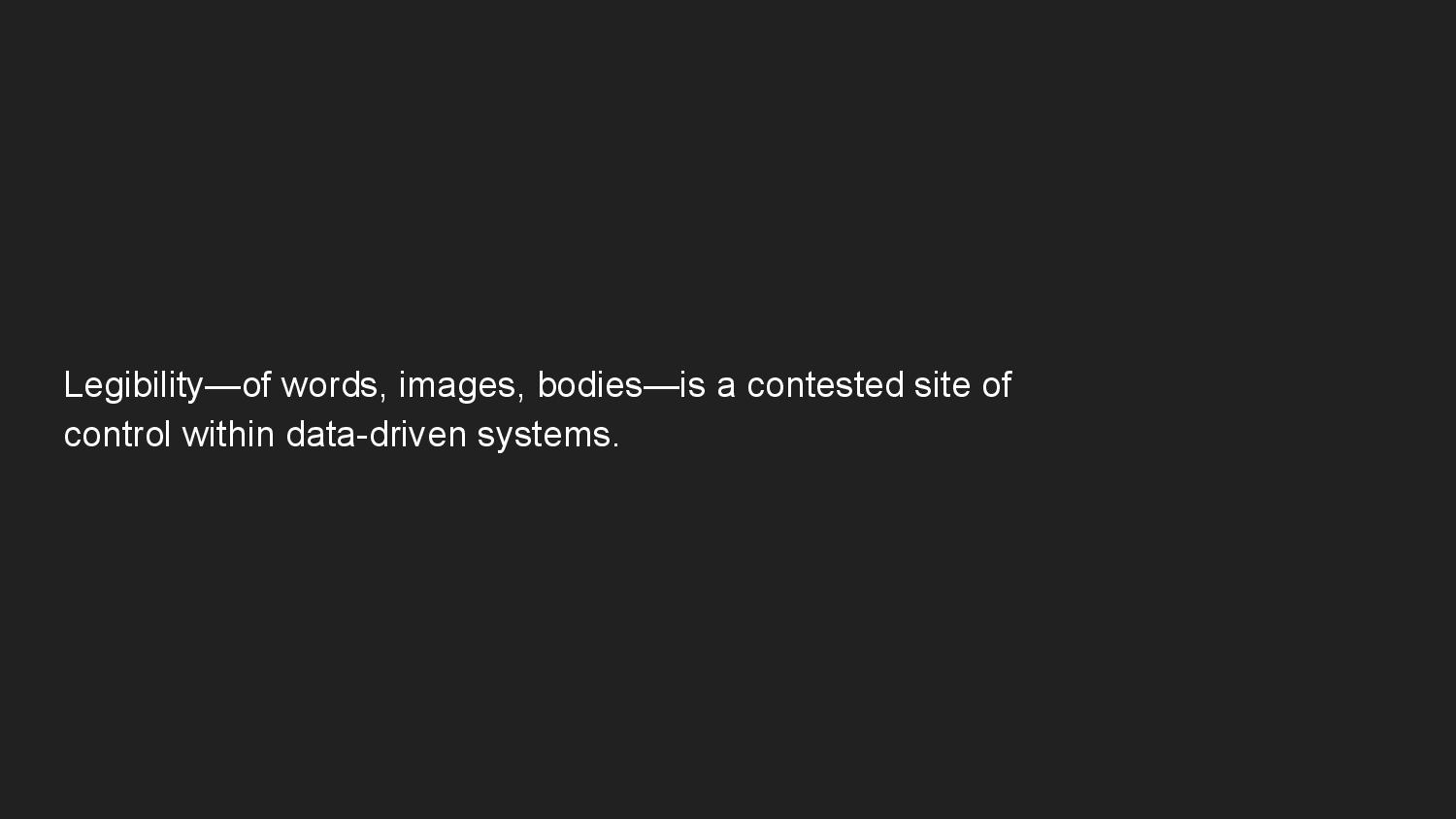
These two projects organize my thinking around the idea of legibility—as applied to words, images, and bodies—as a contested site of control within data-driven systems. And in particular, in the realm of reading, viewing, and gazing, this work frames legibility and illegibility as tools of control and resistance.
In drawing an opposition between Heidegger and Henry James on the question of mechanical writing, I’ve positioned legibility and individual difference in tension with each other. Mechanization is predicated on standardization, which is both what achieves legibility for James while denying difference for Heidegger. This tension is present throughout the history of typography, which is “marked by a persistent drive to rationalize.” And it’s also a recurrent theme in interface design and human-computer interaction writ large—in what Gianni Barbacetto calls “the conflict between algorithm and hermeneutics, between the power of formalization and the richness of the production of meaning.”
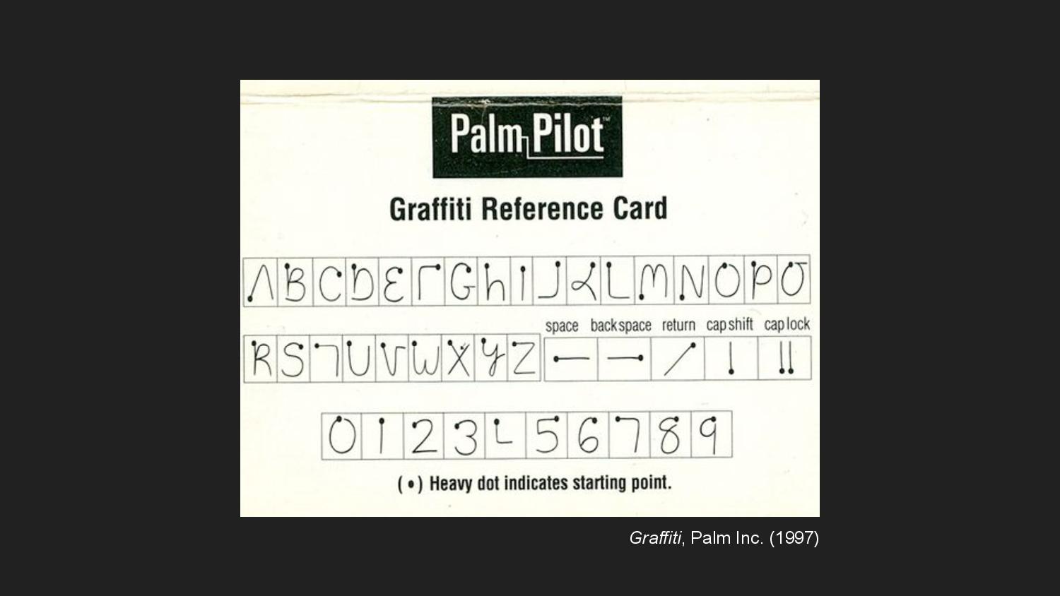
This is a reference card for Graffiti, the handwriting recognition system developed for the Palm Pilot. To enter letters into the device, people would make gestures that corresponded to letters using a stylus. Due to the limitations of the recognition system, each gesture was limited to a single stroke. The result was this neatly constrained set of letters designed to be legible first to the machine, then second to a person, holding these two modes of reading in tension.
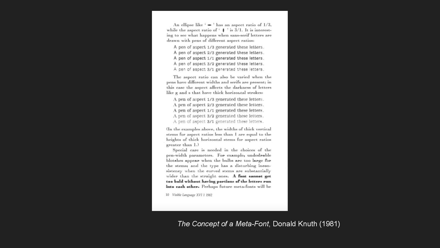
Where Graffiti was an attempt to formalize handwriting such that it was legible to a computer, Donald Knuth’s MetaFont attempted to increase digital type’s expressivity to the human eye. MetaFont is a parametric type system that generates a space of possible fonts using a set of numeric parameters. These parameters model a metaphorical pen—its slant, its curliness, its boldness, its superness, and so on. Each particular realization of a set of parameters instantiates a different font as if tracing over the same letterforms with a different pen.

Dexter Sinister, which is the design collaboration of David Reinfurt and Stuart Bailey, would later adapt MetaFont to create a new typeface. Meta-The-Difference-Between-The-Two-Font, as it’s called, conceives of time as an additional parameter. Rather than being a typographic system like MetaFont that generates fonts which are instances of the system, Meta-The-Difference-Between-The-Two is understood as “a single typeface that’s simultaneously many typefaces and never stops moving.”
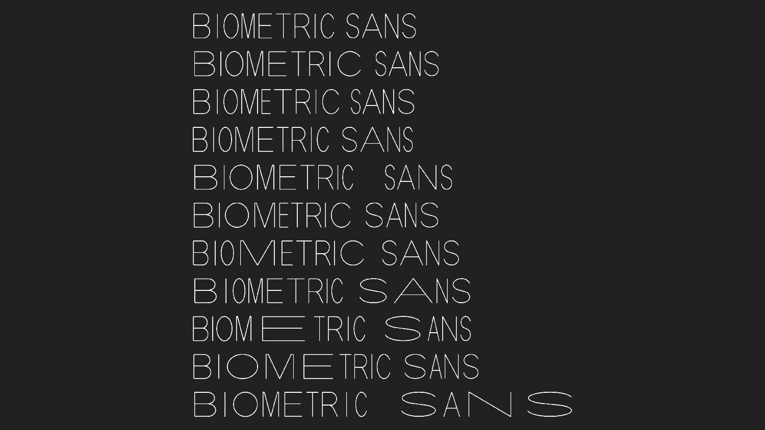
In Biometric Sans, we can trace the influence of these ideas. It’s a typographic system, but one which abstracts over letterforms rather than fonts. And time is treated as a parameter, but not in the sense of time passing abstractly. The varying lengths of the letters captures the cadence of writing, which is something we usually associate with spoken communication. In this way, Biometric Sans is also complicating the orality and literacy distinction. This cadence has implications for the legibility of the text, both in the sense of one’s ability to read it quickly but also in suggesting a pacing with which the text should be re-performed when read.
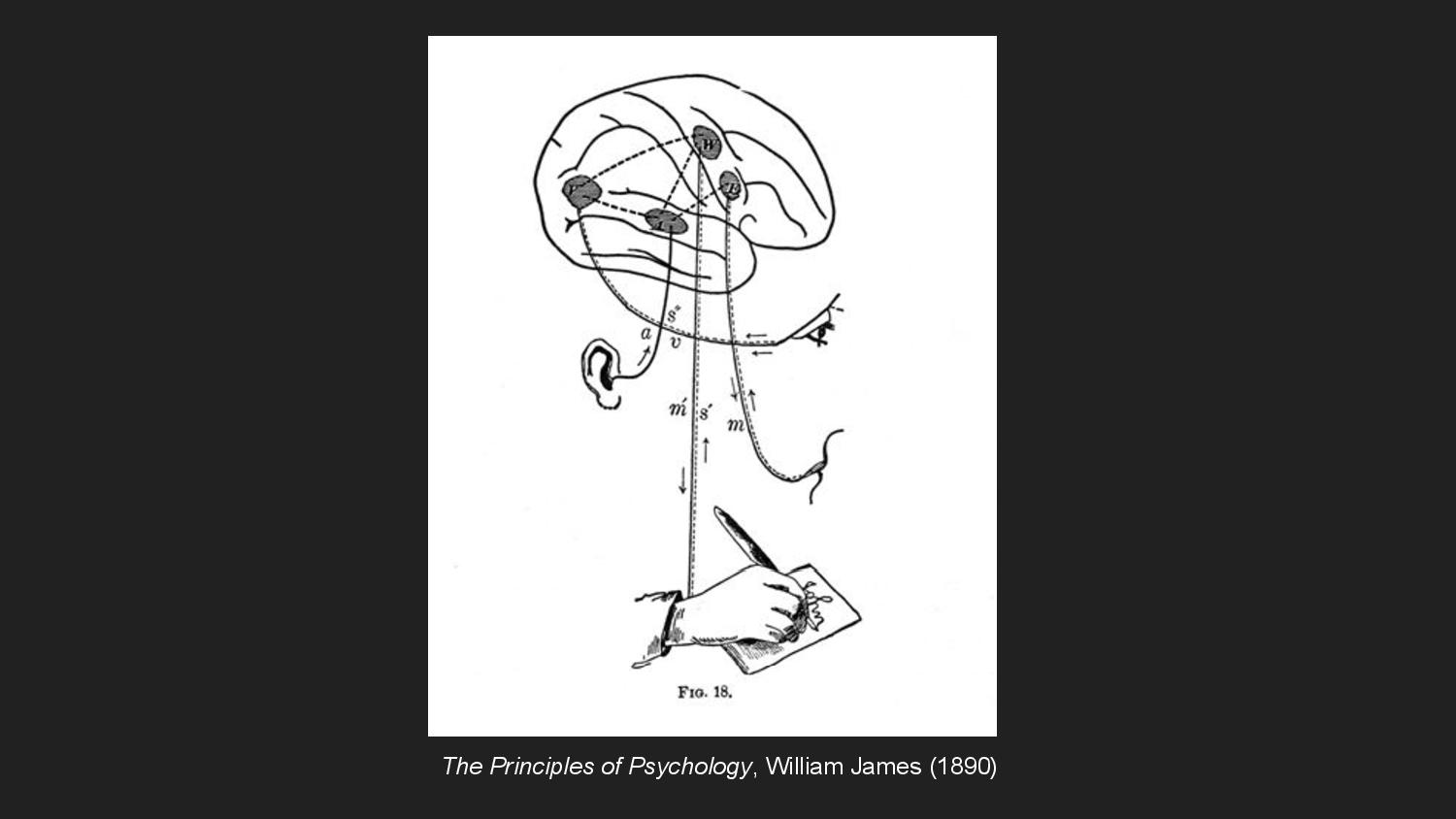
Because temporality is expressed visually in Biometric Sans, the process of typing might become a feedback loop of writing, reading, and rewriting. The writer-performer might type something, see the way it looks, and retype in order to seek out a better letterform to evoke the right cadence, tone, or connotation. This loop echoes a kind of simultaneous reading and writing indicated by this figure from psychologist William James, who was Henry’s brother.
Up until now, I’ve largely been conflating digital writing using computers with the mechanical typewriting that Heidegger was talking about. And for the most part, this assumption works because we understand digital fonts as continuous with the drive toward mechanization and standardization that Heidegger was concerned with. But I thought it worth complicating this a little, in order to keep myself productively unconvinced that technology has so completely estranged the hand from writing.
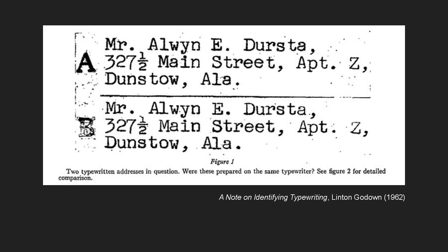
When thought of relative to the computer, we understand typewriters to have many of the analog, spontaneous characteristics we associate with handwriting—the specific wear and damage to the metal of certain oft-used letters, the unique speed and pressure with which an individual might strike a given key, the tug of gravity on the ink, the absorptivity of the paper. The piece of writing from which this figure is drawn is concerned with differentiating individuals by the typewriter they used to produce writing, as one would differentiate handwriting. Our contemporary reference point helps us understand a sense of shifting goalposts in how writing technology is regarded in relationship to the hand.
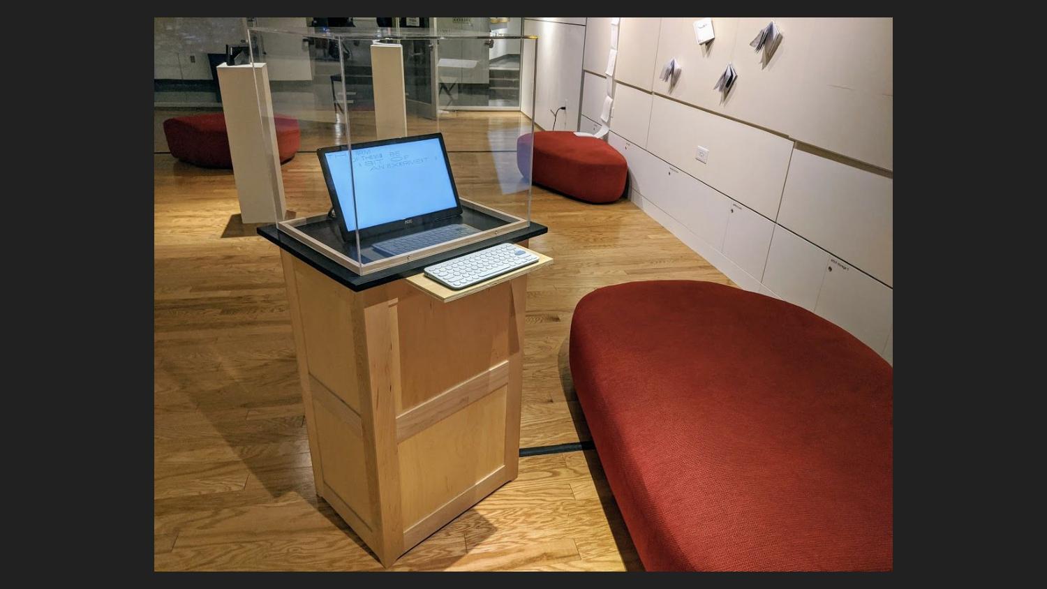
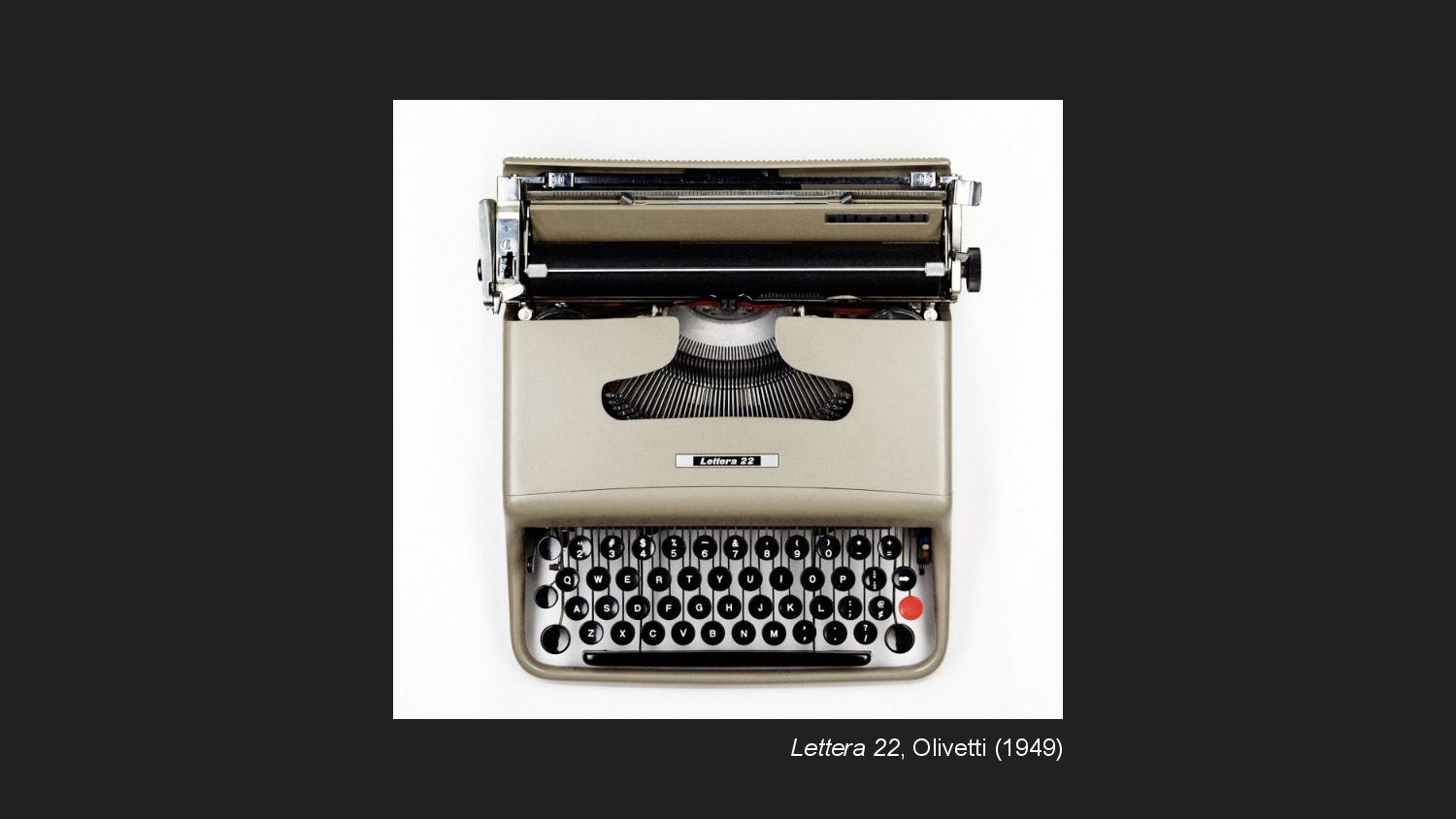
For this and other reasons, the typewriter as an object has held a lot of fascination for me. I often characterize Biometric Sans’ installation in gallery spaces as a digital typewriter.
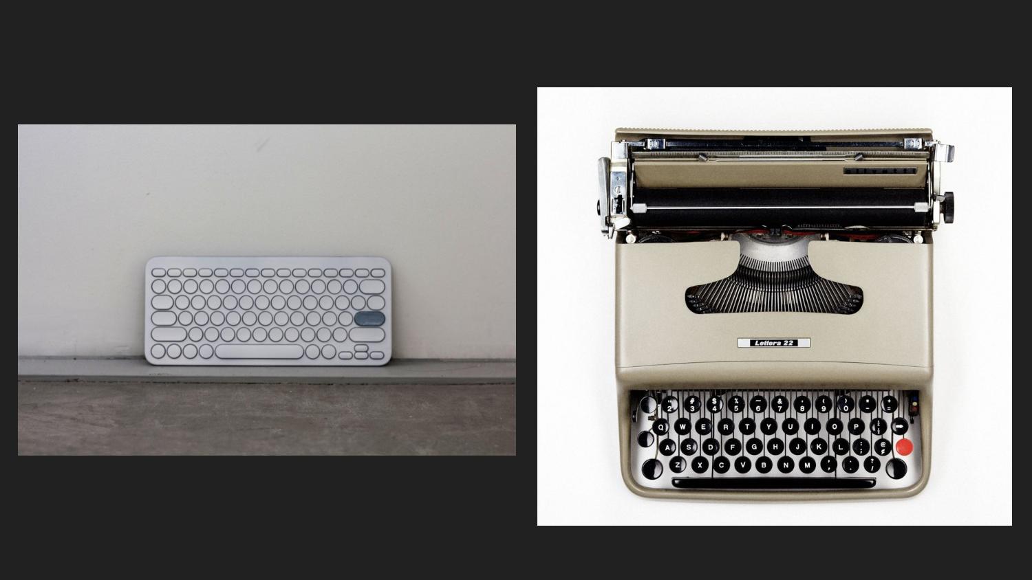
Here’s a photo of the keyboard used in a recent exhibition at MIT. I designed it to reference the signature playfulness of Olivetti’s keyboards, which often featured a bright red tab key.

In other installations, I’ve perhaps demanded more commitment to the typewriter metaphor by directly printing letters to paper on each key press, removing the decidedly computational capacity to travel back in time and edit one’s own writing.
And, anyway, I find typewriters interesting because they act as a stand-in for my thinking about interfaces more broadly. An interface, as I think of it, is a boundary where the body encounters mechanization. At this point of contact, people and systems have to conform to each other to be understood. Within our present historical reference frame, typewriters are the transitional hinge between handwriting, the form of writing we most naturally consider to be fully analog, and word processing, the one we consider to be fully digital. And they’re an object that complicates how we think about both.
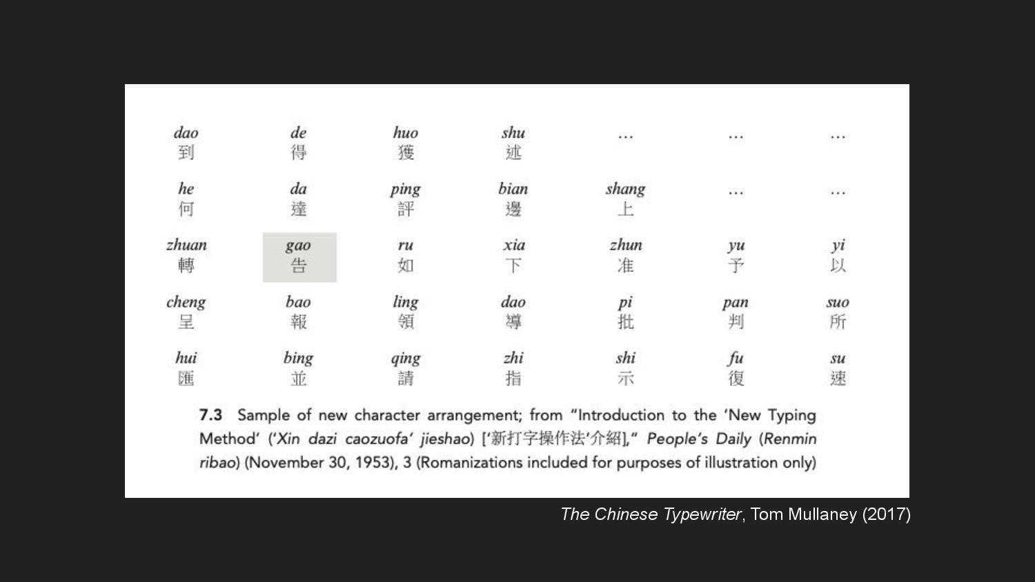
There’s a great example of this in Tom Mullaney’s book on The Chinese Typewriter, where he explores how Chinese typists in the 1950s were able to increase their typing speed two- to fourfold by creating idiosyncratic layouts of characters on their typewriter trays. By creating close spatial relationships between characters that commonly co-occur, this practice, Mullaney argues, prefigures the digital technology of predictive text. The typists embody predictive capacity in what Connerton calls habit-memory: “a knowledge and a remembering in the hands and in the body.”
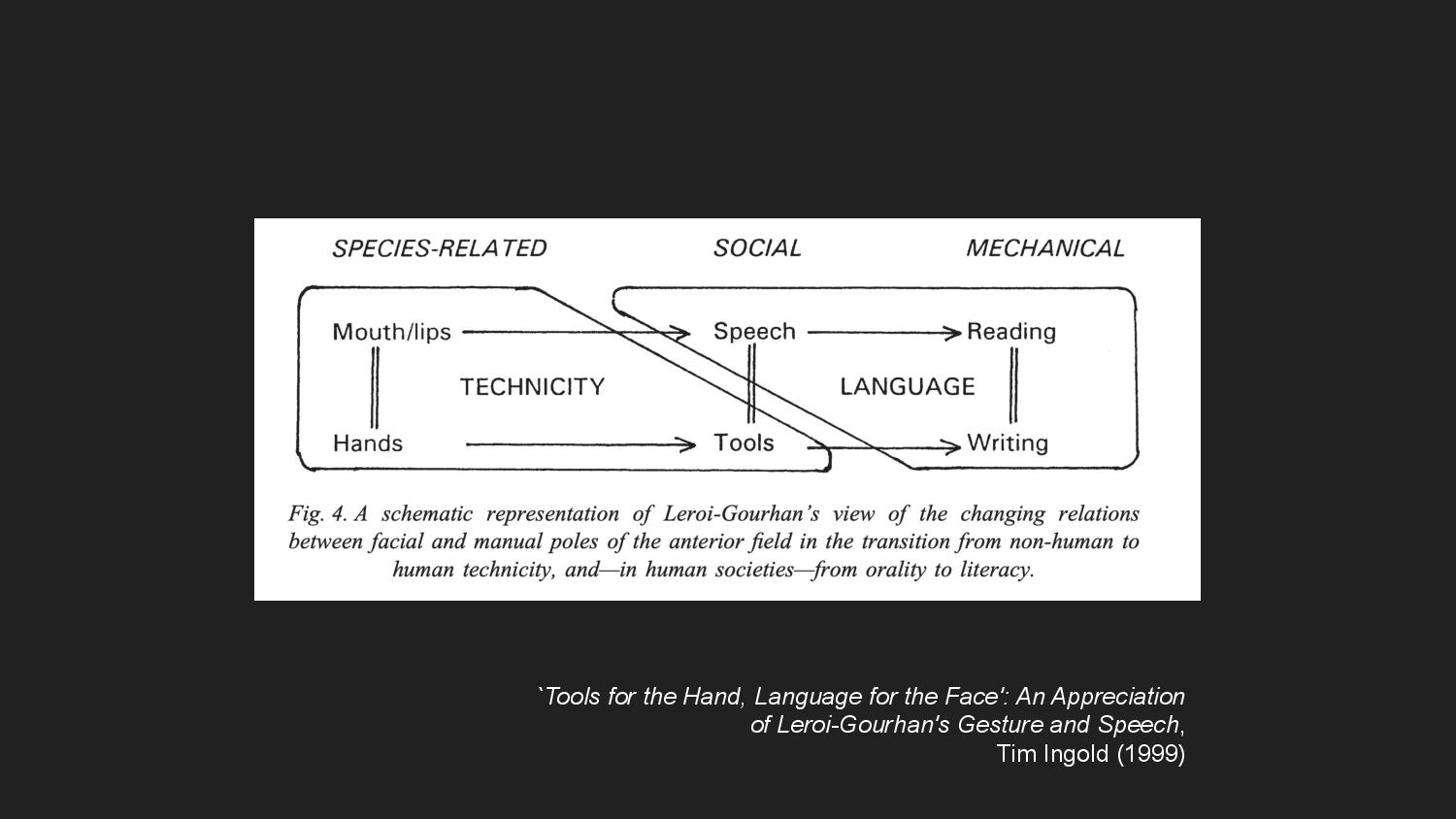
The typewriter interface connected the embodied knowledge of the typists to the mechanical capacity of the typewriter, facilitating a process of “exteriorization”—in which the source of operational behavior is displaced outward from the body. Bernard Stiegler, in the theory of grammatization, considers the technology of writing to be an exteriorization of memory. What was once known in the body is stored externally through traces and inscriptions. And the French anthropologist Leroi-Gourhan traces a movement of exteriorization in the domain of technicity that is parallel to the one in linguistics—a movement from handwork, to the handling of tools, to machine automation.
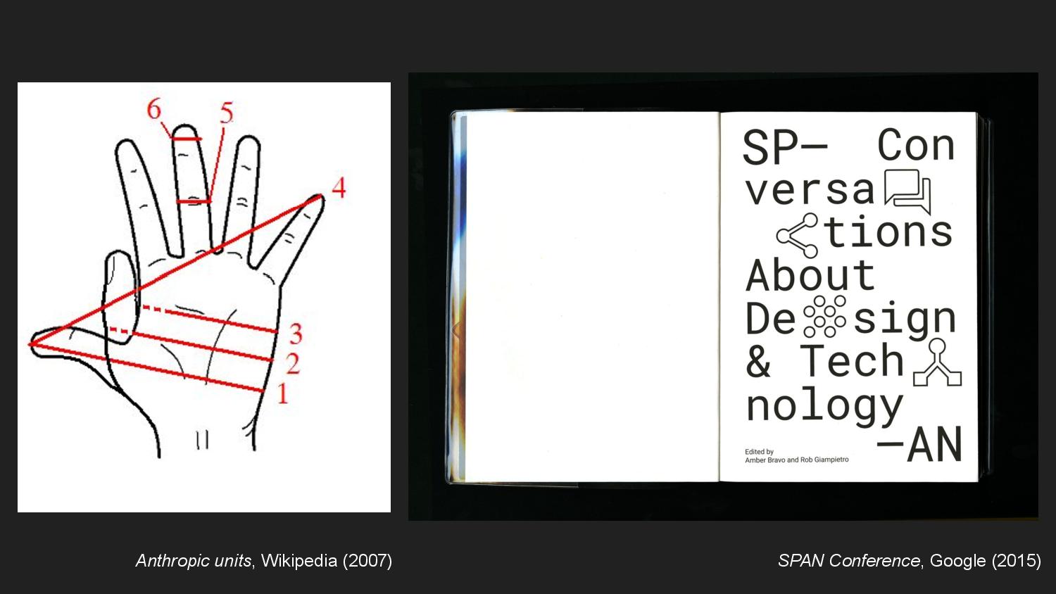
Formalization is predicated on standardization and interoperation, and so to create standard references against which to measure, there needed also to be a move from measurement units rooted in the body toward external, rational units. I like to reference the span, which was a unit based on the width of the hand.
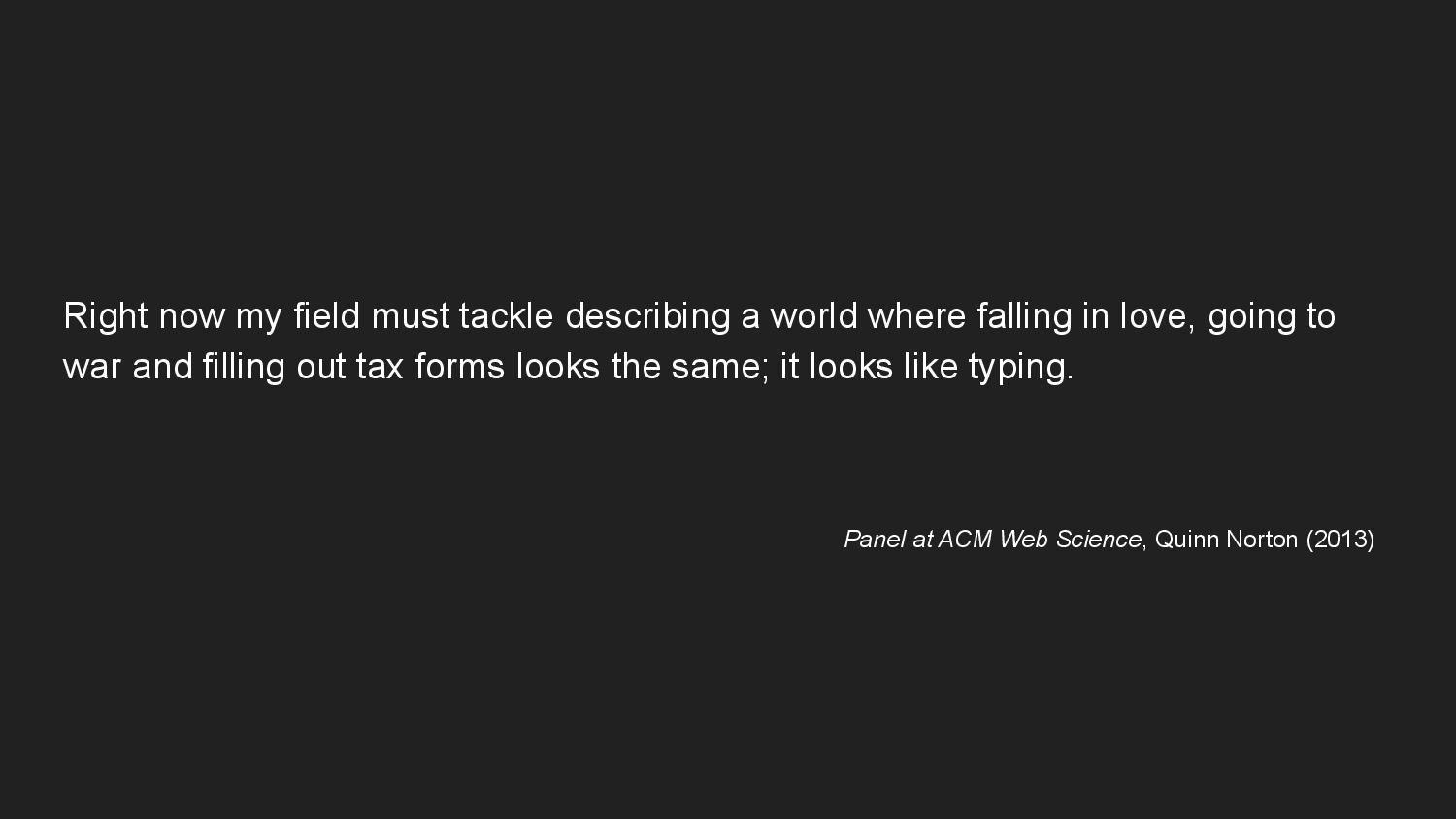
As our world continues to increase its reliance on formalization in the domain of computation, the act of typing—an act which crosses the boundary between body and machine—starts to take on endless significance. Writer Quinn Norton observes, “falling in love, going to war, and filling out tax forms looks the same; it looks like typing.”
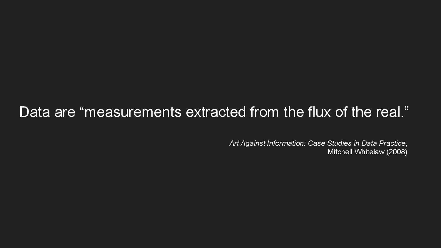
And data—that inescapable thing that makes love, war, and taxes possible today—is a consequence of that process of exteriorization of measurement. I learned of Mitchell Whitelaw’s definition for data from a talk by Mimi Onuoha, which I find endlessly helpful: “data are measurements extracted from the flux of the real.” And because data is a primary way in which digital systems apprehend the real—i.e. the real is made legible to those systems—data ultimately serves to exteriorize knowledge.
Data, like the written word, is an inscription. It’s a trace of something that was measured in the past but is now absent, that when read calls to mind, or re-presents, the object of measurement. And just as there are limits to language’s ability to communicate the experience of something, there are limits to data. The difference, however, is that data is often used in service of claims to objectivity and universality. This is what feminist STS scholar Donna Haraway calls the “god-trick”; the illusion that data is so external to the body that it is fundamentally distanced from it, and can be used to make objective knowledge claims from a disembodied perspective.
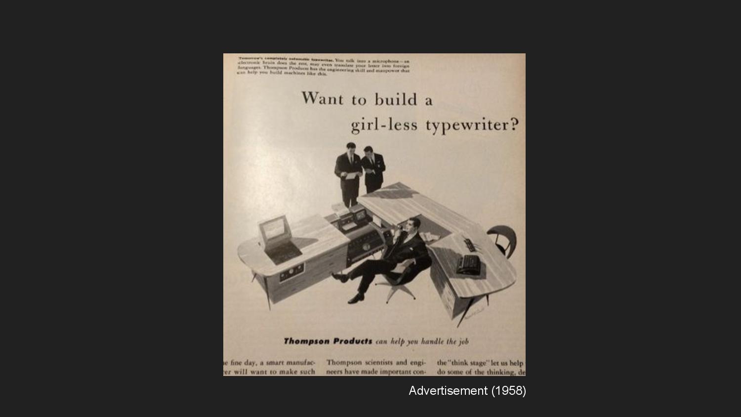
Of course, the movement from writing to typing to computing could not escape the body, nor was it ever going to. Instead, it relied on the gendered labor of invisibilized bodies. This advertisement is an example of, how, the word “typewriter” was used to refer to a person, not a machine. That person, almost always a woman, would receive dictation and type it into the machine. Henry James, whose own body could no longer write with its own hand, dictated to a typewriter, his secretary. “Fiercely legible,” he claimed the result to be, even as the process erased (or rendered illegible) the body and labor of another.
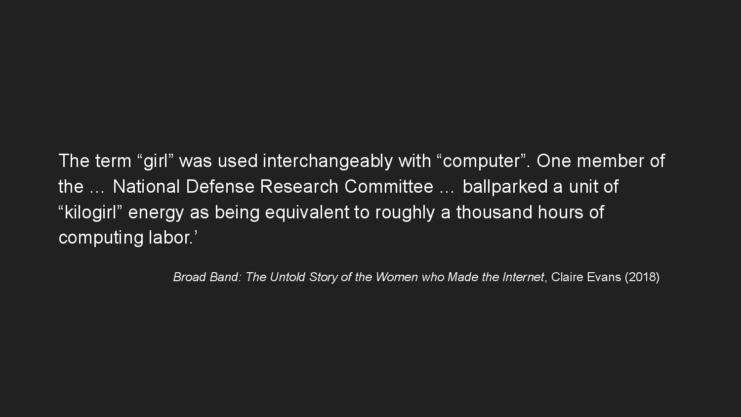
As the work of scholars such as Claire Evans and Mar Hicks show, similar dynamics took place in the computing workforce, until women were systematically forced out once computing became perceived as high-value work. Here, kilogirl is used as an anthropic measurement unit—inextricably tied to the body, but women’s bodies in particular.
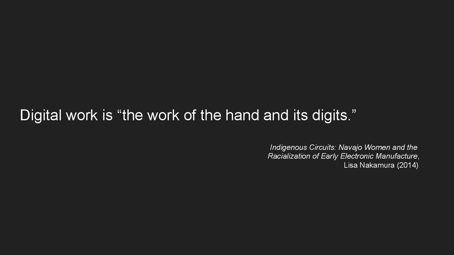
These historical moments are reminders that, as feminist scholar Lisa Nakamura writes, digital work—such as typing—is “the work of the hand and its digits.” The digital, no matter how it might present itself as such, cannot be understood universally, which is to say without reference to embodied difference.
But parallel to the realm of reading and writing, we see the same movements toward disembodiment, exteriorization, and datafication in the realm of vision—in the act of seeing. My Public Display typeface brings the questions we’ve been asking of graphic design and written communication in conversation with the history of photography, in which the right to represent or be represented has been contested ground.
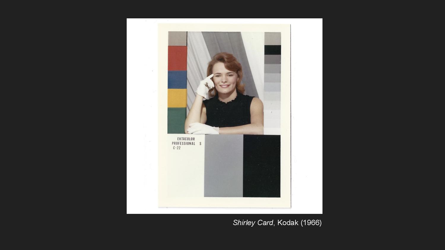
To make color-film photography possible, Kodak needed to develop a standardized measure for color. For about fifty years, they used Shirley cards (which were named after the person who was the model in the original) to calibrate colors against a default of white skin. As a result, the technology was incapable of properly representing black skin.
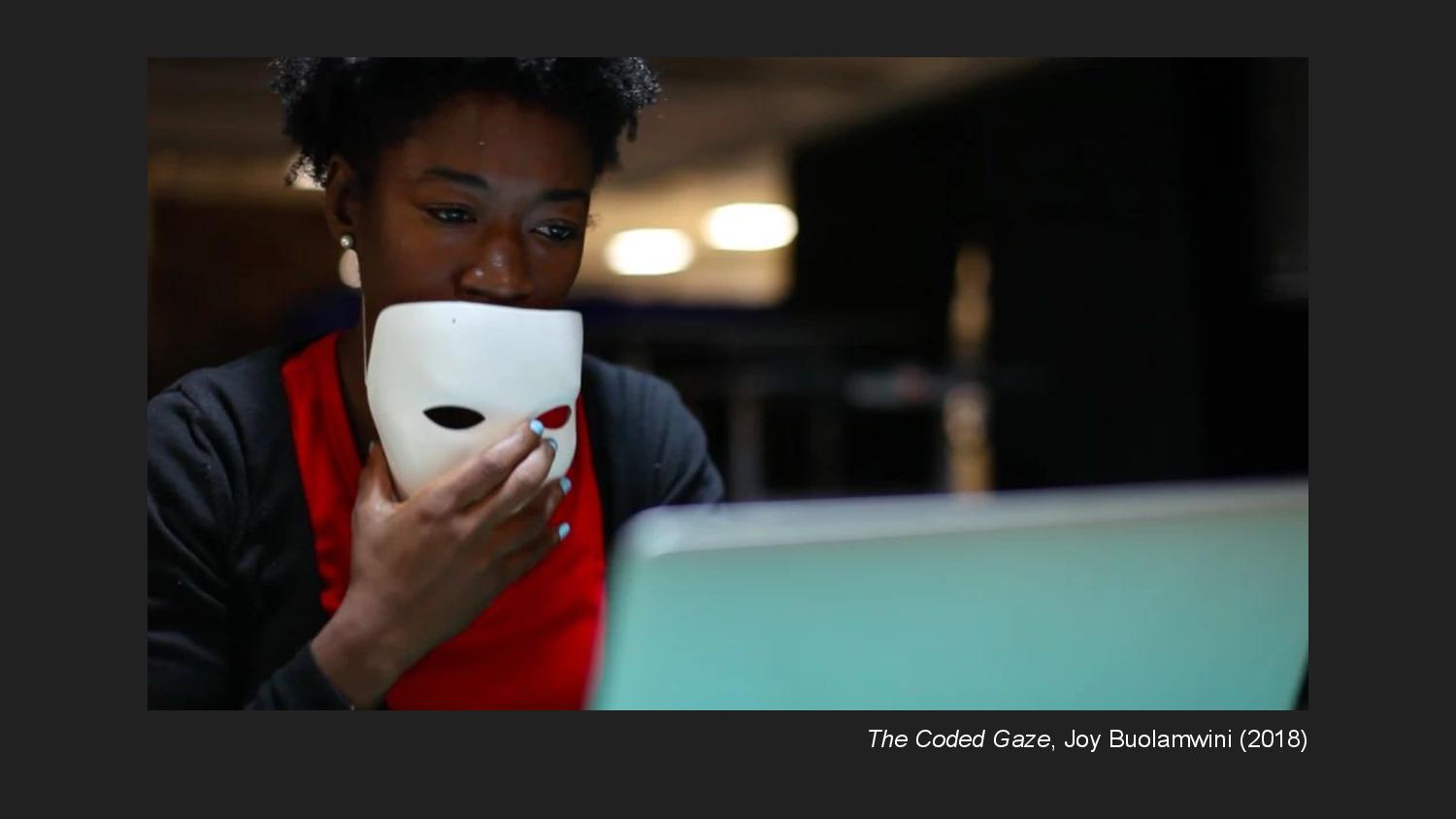
This exclusionary default is reflected in conversations now about facial recognition technology. Joy Buolamwini tells a story about being more legible to a facial recognition system when wearing a white mask than with her actual face. She has done work empirically testing different facial recognition systems to show that they exhibit intersecting biases across race and gender categories.
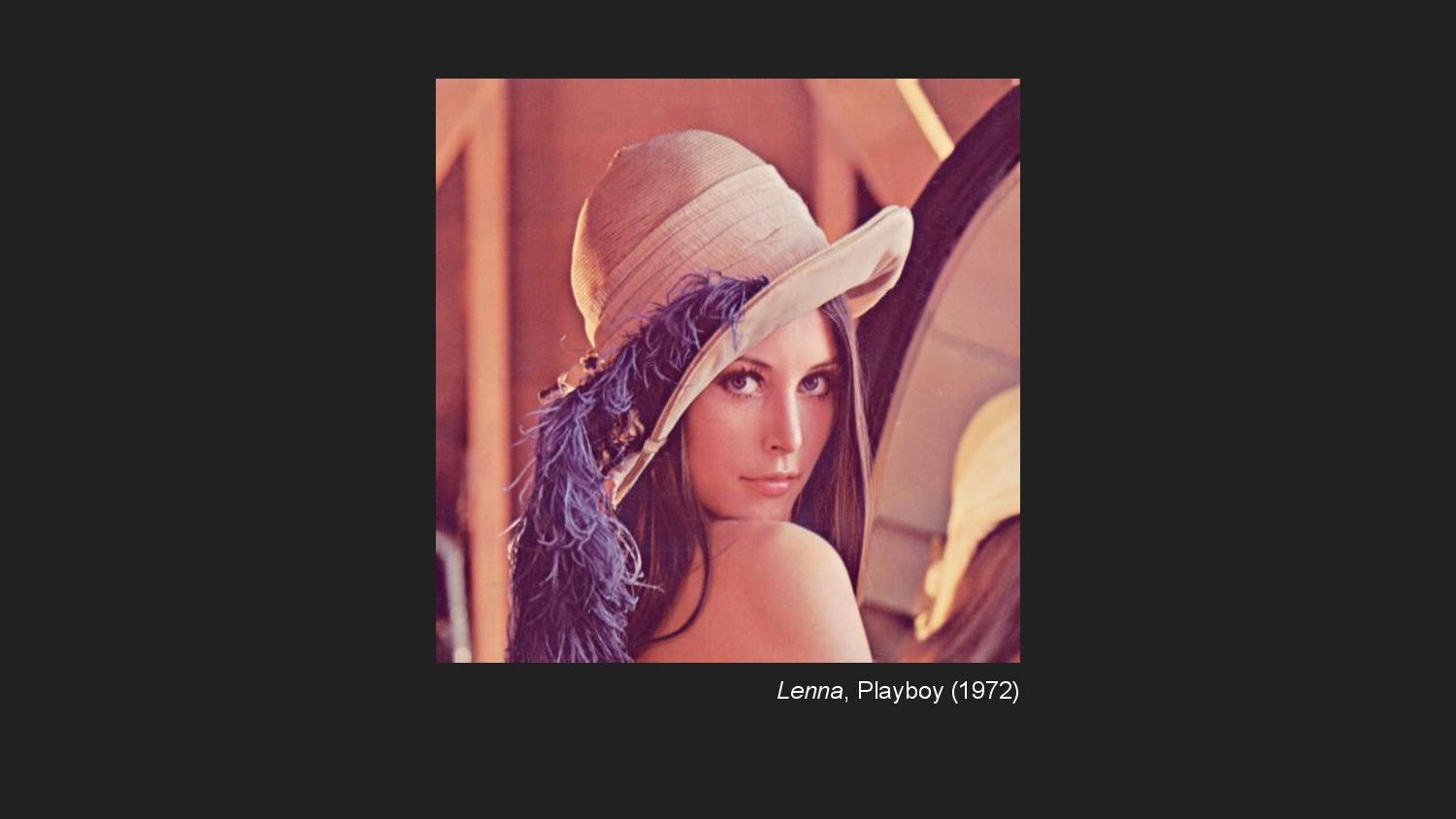
The corollary to Shirley cards in digital image processing is this cropped nude of Lena Forsén, which has been used as a standard test image since the 1970s. When she was later invited to a conference of the Society for Imaging Science and Technology to be recognized for her strange role, scientists in attendance were surprised she was a real person.
These examples are fraught because they show how the development of photographic technology is inextricable from questions about the right to be recognized as a subject. I created Public Display using images from a facial recognition training dataset because the ubiquity of data and surveillance has complicated these questions. To be under a watchful and surveillant eye is a condition of hypervisibility—of being too legible—explored in Public Display through the intervention of erasure. When I gave an overview of the typeface earlier, I talked about the tension Public Display introduces in the act of reading between the whole and the part—between words and faces.

This interest in whole-part relationships for me comes from gestalt psychology, which has been a central tenet of graphic design for the past century or so, although psychologists seem dissatisfied with it now. It’s certainly part of how I was educated in graphic design. From my former teacher David Reinfurt’s syllabus, we understand Gestalt psychology’s account of perception to claim that “we perceive the world in organized wholes, not in parts. These wholes are our primary sense reports — they are not contingent on, nor constituted by elementary sensations.” Rubin’s vase, the optical illusion in which the relationship between silhouetted faces and a vase becomes unstable in our perception, is achieved through a careful balancing of whole-part relationships in the use of figure and ground.
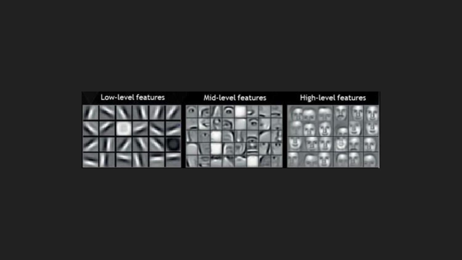
The gestalt principle, I would argue, is also present in theories of machine perception. Here you see visualizations of progressively deeper layers of a convolutional neural network. The neural network learns to sees faces by organizing its sensory input into abstract feature representations. These representations are distinct semantic units—edges, eyes and noses, faces—and the network learns progressively more abstract visual concepts the further into the layers you go. And machines perceive input images primarily in terms of these assembled semantic concepts, not their raw sensory material.
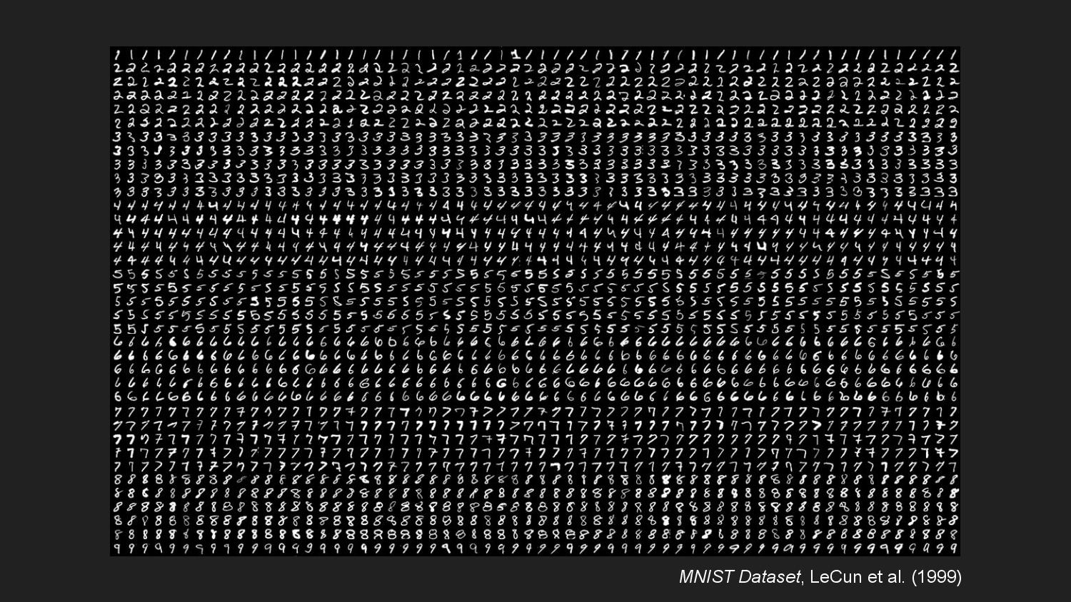
Machine vision has been used in optical character recognition to formalize handwriting into computer-readable units. These developments were made possible by the existence of large datasets of handwriting samples, such as MNIST.
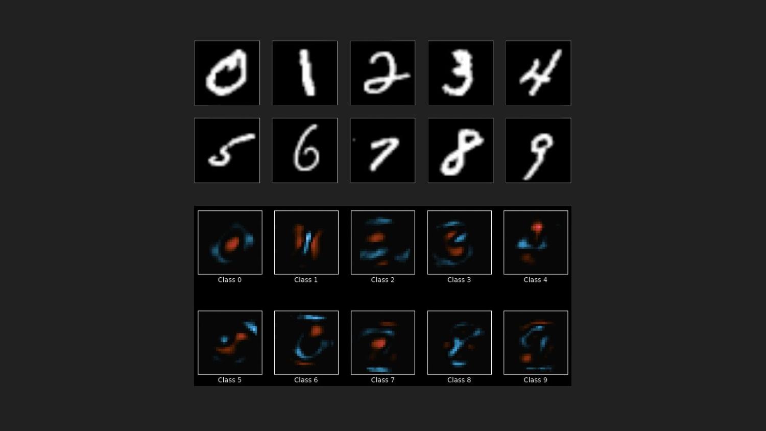
In the process of making something legible to a computer through machine learning, a program aggregates large amounts of data and assembles abstract representations of those aggregate properties. Here I’m showing visualizations of what a trained classifier thinks the essential visual properties are that distinguish each digit from other digits. In this, I see echoes of Donald Knuth’s project with MetaFont. As Dexter Sinister write, for Knuth “the way a single letter is drawn—an a priori A, say—presupposes and informs all other letters in the same font.” For each letter, Knuth chose a letterform to serve as the essential base shape that his parametric pen would trace out. One might imagine the use of machine learning to create a Meta-MetaFont, one for which the base form of each letter is not predetermined.
Facial recognition exteriorizes vision as data-driven abstractions that are encoded into machines. The use of facial recognition in surveillance tends to take on a disembodied point of view, through the detached perspective of surveillance cameras mounted in public places, or on the dashboards of police vehicles. One need only look toward the fraught conversation on the limitations of police bodycams to see how surveillance relies yet again on the fact of its disembodiment to make claims of objective representation.
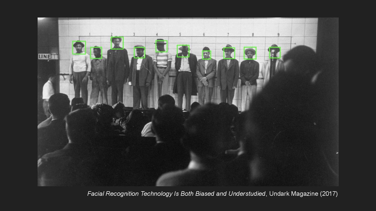
Facial recognition systems are increasingly integrated into policing practices that disproportionately target communities of color. The common practice of academics and corporations building facial recognition is to mine photos of unsuspecting individuals on the internet without their knowledge or consent, public figures and private citizens alike. These entities seek to train algorithms to read patterns within faces, but the line between pattern matching and racist phrenology is often thin.
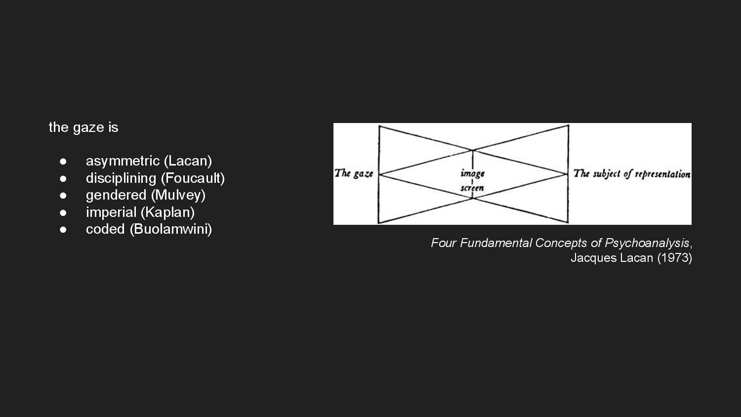
Buolamwini’s “coded gaze” is part of ongoing efforts to theorize the gaze—as well as vision and visibility—as contested sites of power and control. The gaze establishes an asymmetric power relation in which the watching has power over the watched. For Lacan, an awareness of being visible is accompanied by a loss of autonomy. So too for Foucault, who takes the gaze to be a form of discipline, coercing the watched to adjust their behavior according to the watcher’s eye. Mulvey’s theory of the male gaze understands the gaze as a tool of domination, objectification, or dehumanization, as does Kaplan’s imperial gaze.
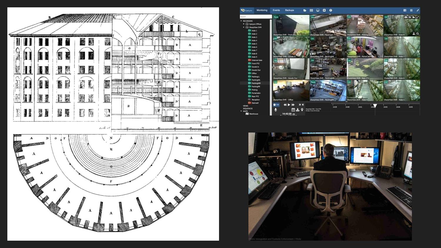
Like Jeremy Bentham’s panopticon, data-driven surveillance “abstracts power out of the bodies of disciplinarians into a universal, disembodied gaze.” As literary scholar N. K. Hayles writes, “the specificities of [the disciplined’s] corporealities fade into the technology as well, becoming a universalized body worked upon in a uniform way by surveillance techniques and practices.”
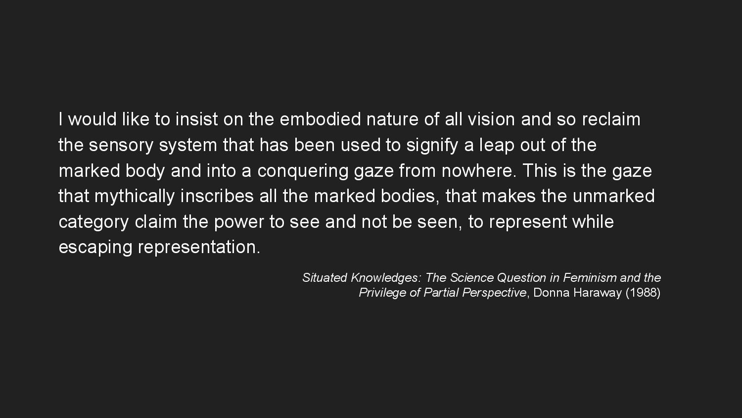
And so recognizing embodiment and subjectivity against surveillance, is to resist the adoption of what Haraway calls the “conquering gaze from nowhere,” which allows the watchers to “claim the power to see and not be seen, to represent while escaping representation.”

So to start to draw these threads together, I want to return the conversation to graphic design. Historically in graphic design education—or maybe just in my own particular education, anyway, who knows—there’s been a pedagogical split between typography and visual form. And I find this language vs image distinction endlessly fascinating in the way that it’s repeated across other conversations about communication modality that I find myself in, notably in data visualization.
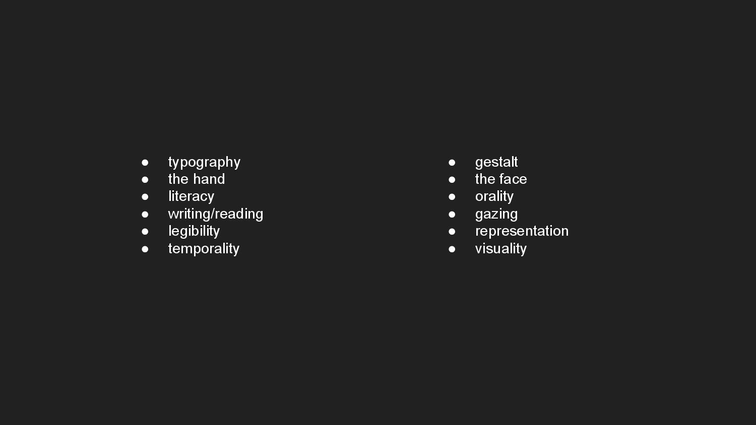
Thinking through this distinction allows me to organize my thoughts into a series of analogies. These are overlapping concepts that I think belong to one world or the other, typography or gestalt. In particular, pairs of words like reading and gazing, legibility and representation, are different words in my mind that refer to concepts that are inextricably linked and also maybe not entirely distinct.
The CFP for this conference, Before and Beyond Typography, asks: “what becomes of our understanding of ‘-graphics’ when we dislodge the prefix ‘typo-’ from its long-dominant position and place it alongside those of ‘chiro-,’ ‘xylo-,’ ‘litho-,’ ‘mimeo-,’ …”?
My work is very sympathetic to this question, not necessarily out of concern with typography’s ostensible dominance, but in my desire to complicate the boundary drawn in the field of graphic design between written and non-written visual communication. Leroi-Gourhan would understand the drawing of this distinction as a modern phenomenon, a consequence of the parallel exteriorization of both language and technicity. And so both Biometric Sans and Public Display operate as both images that are read and letters that are viewed. And I’m quite happy with that bit of indeterminacy.
Anyway, I think in the end a call to complicate these conceptual boundaries, for me, comes back to a call for re-embodiment—of writing, of vision. And in playing with legibility, we might find avenues for resistance within data-driven systems by failing to be measured, or be read, or be seen. Thank you.